Friday, April 8, 2011

These Caricatures Are the Pitts

Yeesh, kill one prostitute and suddenly you find yourself in a state correctional facility for twelve months!

But thanks to the combined efforts of a prison-issue spork, a Rita Hayworth poster, and a little bit of elbow grease, I'm back to celebrate the anniversary of my last post by making fun of a talented artist whose body of work I greatly admire!


There are many great things that can be said about Dan DeCarlo. Heck, the guy basically defined the Archie style while creating every character that people actually remember outside of the regular cast (Case in point, if you mention Li'l Jinx to someone, most people think you're referring to an obscure rapper). And there are plenty of blogs out there that sing his praises on a regular basis.

Only on my blog, though, do you get to hear about his sordid history of crappy celebrity caricatures!

Well, okay, he could draw celebrities fairly well while adhering to the strict guidelines he always followed. But this picture is just weird.

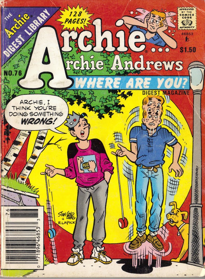
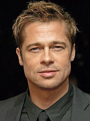
Are those pictures all supposed to be of Brad Pitt? That's what the dialogue seems to imply, though it just looks like a collection of Archie Comics-Style Generic Pretty Boys tm. They don't even look alike. Also, one looks just like Reggie.

Maybe Archie singled out Brad Pitt for... some indiscernible reason? Okay, it's clear Dannyboy should've just drawn a bunch of Brad Pitt pics, because I have no idea what's going on with this cover. But which one is supposed to be Pitt anyway?

Oh, clearly it's.... I have no idea....


Well, whatever's the case, I'm sure we can all forgive Dan for deigning to look at a picture of a celebrity for the cover of an internationally-distributed comic book so that he could focus his energy on what was really important: depicting Veronica's right breast. That he never phoned in.

So, depending on when the Feds finally close in on my undisclosed location, I'll be back soon with more comic-based commentary! Stay tuned!

Friday, April 9, 2010

Under the Covers...


Considering how Archie digests are generally sold through newsstands and supermarket checkout lanes, it makes sense that the covers of the magazines should be designed to attract some attention...


That's why a lot of the covers I've amassed over my childhood rely on fun and sometimes bizarre sight gags. Long time Archie-readers understand that most of the comics in these digests rely on the age-old Archie formulas: Betty plots to steal Archie from Veronica, Veronica plots to steal Archie from Betty, Archie plots to win Mr. Lodge's favor, etc., etc., ad infinitum.

But these covers seem to work best by implying that the books are filled with crazy antics, cartoony gags, and, why not, mythical creatures!


By the time a new reader realizes he's been had, he's already gotten to know the characters, and he's hooked just like the rest of us! Pretty sneaky, Vic!

Even the titles were more interesting back then...

But a lot of covers these days just don't have the same flair...


Nowadays, they're a bit too truthful: "If you enjoy cartoon people sitting around and telling jokes that are older than your grandparents, this is the book for you!"

The sad thing is, these books actually have much crazier content than the old books. Between the combined efforts of Dan Parent, Bill Golliher, and the resurrection of Joe Edward's "Captain Sprocket", the covers should imply that anything goes within these pages!

Instead, we get:
At least they're running this time. That's exciting... right?


Look at this one. This is drawn by Stan Goldberg, who made a majority of the crazy covers I've been praising; but nowadays, even his somewhat whimsical covers are betrayed by weak composition and strangely drawn characters.

Seriously, look at Archie's disproportionately tiny skull here. No wonder he's worried about budget cuts; his lack of a good education is causing him to de-evolve into some sort of modern-day homo habilis! Luckily, he can still manipulate stone tools and pass wood shop!

I guess the point I'm trying to get across here is: If you see an Archie comic with Archie and Jughead sitting at their desks, with Jughead saying something like, "If it weren't for Grundy's class, I'd never get any sleep at all!", don't be fooled! Look inside: if you see Li'l Jinx and Fat Charley, crudely drawn Little Archies by Dexter Taylor, or an old Glen Scarpelli in Hollywood comic, you're in for a wild ride...

Keeping Your Problems In Perspective...

Foreshortening and perspective are notoriously hard to pull off in art, especially when you don't have a model to base your drawing on; but if it helps, here's a quick checklist to make sure you got it right...


1) If Jughead's legs seem shorter than his torso, you have a problem.

2) If number 1) is in effect, then all your other problems are moot anyway.


Wednesday, April 7, 2010

What Is All This?

Welcome to my blog, where I plan to dissect the excruciating minutia of my vast collection of Archie comics digests! For those of you who aren't familiar with the term, Archie digest comics collect previously published Archie comics into thick, small volumes with a larger variety. You've probably seen them next to the checkout aisle at Wal-Mart, before your attention was drawn away by some bikini-clad starlet on a tabloid a moment later. But really, who could blame you?

Anyway, being a graphic design student and aspiring artist (i.e., a hobo), I'll probably look at the individual merits of different Archie artists and collaborators, analyze their inking, writing, and storytelling skills, and then make smartass comments about them, most likely.

So, until next time!